The Missing Link: A Waterfront Centrepiece

Much has changed in the Central Waterfront since this photo of the Ferry Terminal was taken in 1910. A new master plan for the Ferry Terminal site is the next step in the ongoing revitalization of this area.
POSTED: DECEMBER 3, 2015 I DESIGN, PARKS AND PUBLIC SPACES
BY: MIRA SHENKER
As you can see from this snapshot of Queens Quay in the 1970s posted by BlogTO, things have changed along Toronto's main waterfront street. By the 1970s, the area known as the Central Waterfront was no longer serving an industrial use and had become a mostly uninviting thoroughfare. Emerging from this post-industrial state has been a long process. 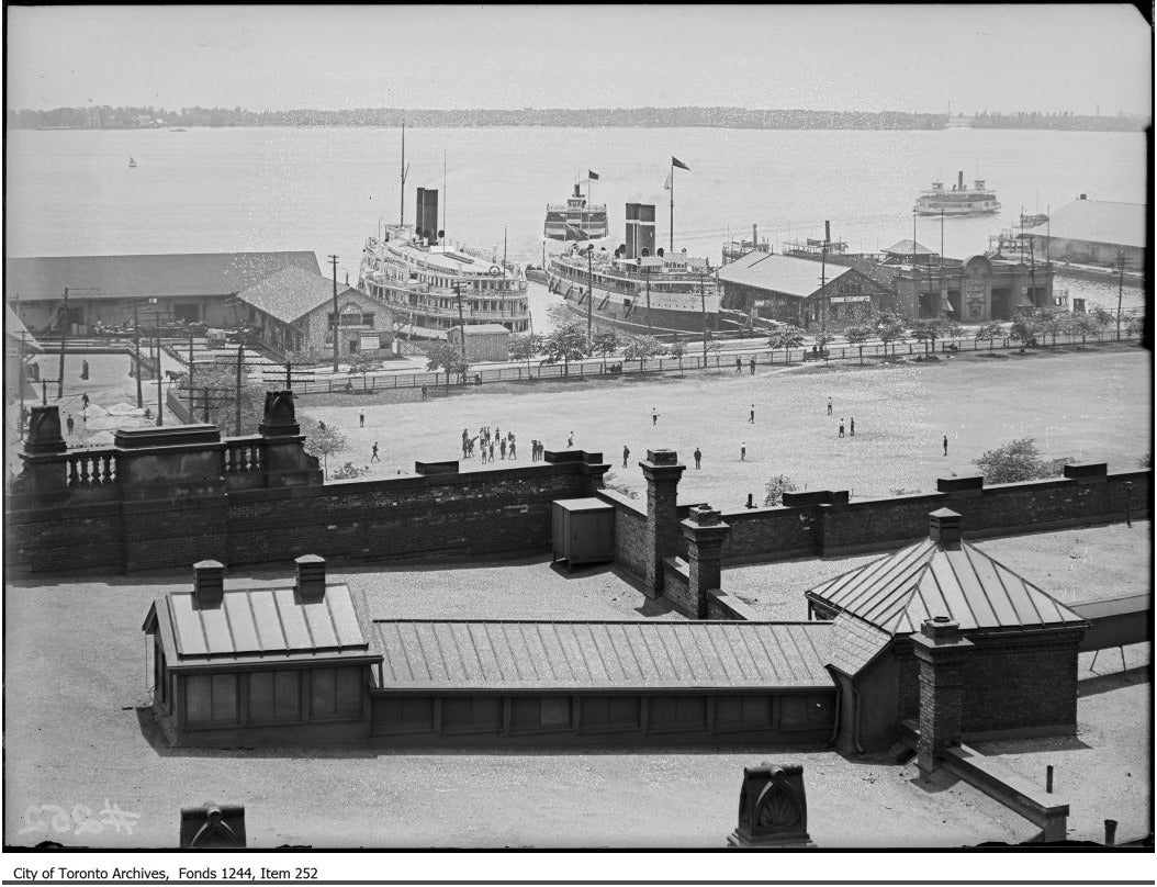
The recent revitalization of Queens Quay is a major milestone in the ongoing transformation of the Central Waterfront. The next step: a master plan for the Ferry Terminal site at the foot of Bay and Yonge Streets.
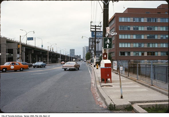
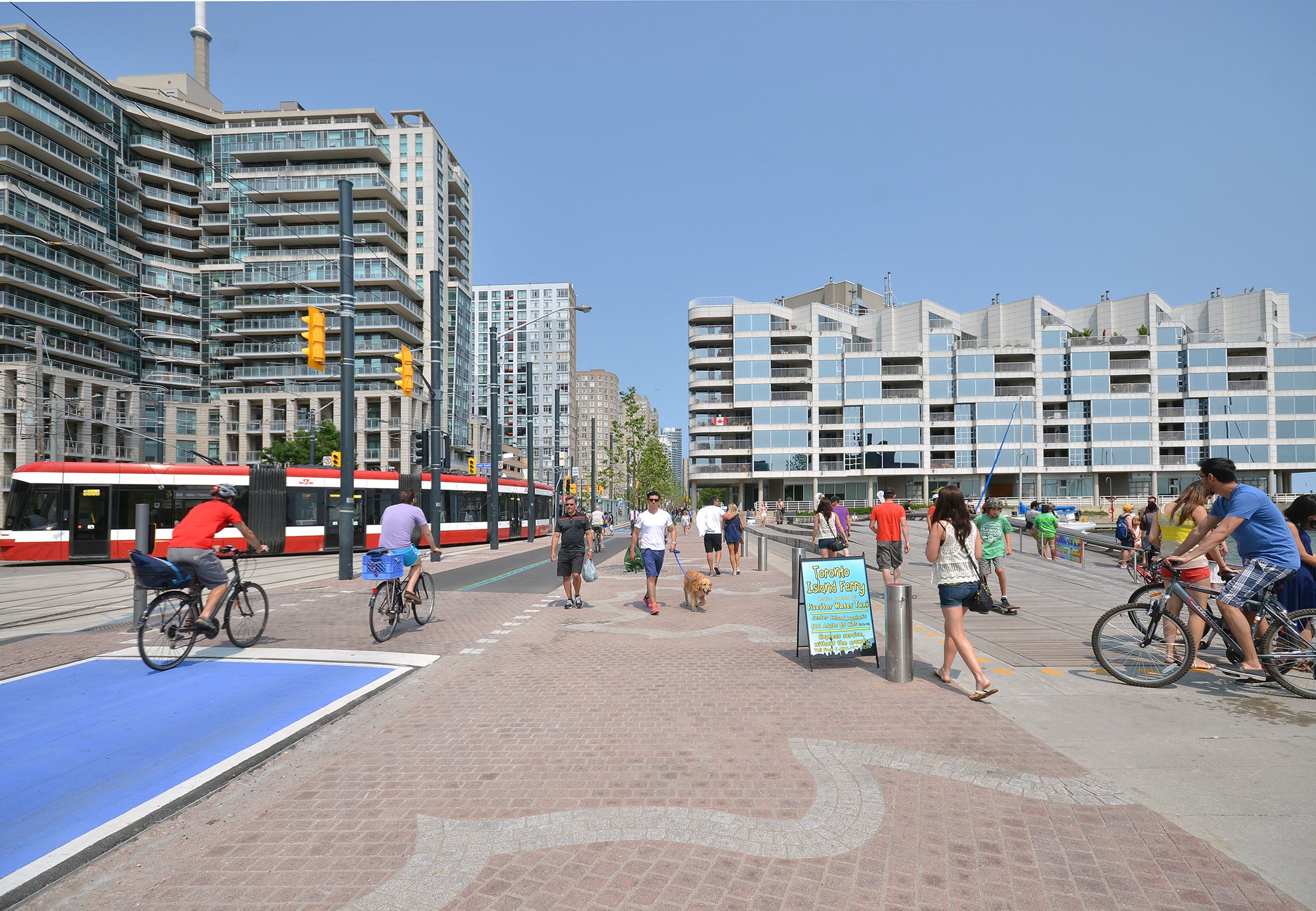
Top image: Looking east at Queens Quay and Spadina in the 1970s (Image via BlogTO). Above: Looking east at Queens Quay and Spadina today.
Like Queens Quay, Toronto’s Ferry Terminal has been slowly changing over the last few decades.
As part of a wave of redevelopment in the late 1960s and early 1970s, a new ferry terminal was designed by architect Walter Agius. Additions were made in 1976 by Bernard Gillespie's architecture firm. In November 2014, we launched an innovative design competition, asking teams from around the world to create a new master plan for the Ferry Terminal and Harbour Square Park.
Rather than erasing the past, the competition seeks to both honour the historical significance of the Ferry Terminal and Harbour Square while also trying to solve some key problems with the site as it currently exists, such as the inhospitable queuing areas and lack of amenities for ferry passengers. The competition brief outlined a large number of features in the area – including Pier 6 – that the design teams had to consider carefully in their proposals.
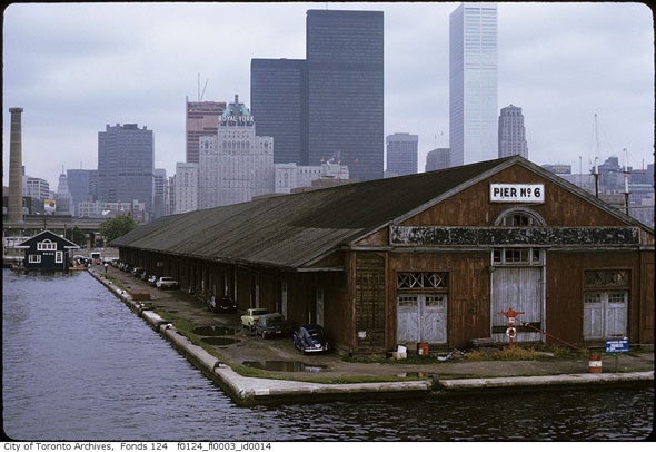
BlogTO’s flashback includes a photo of Pier 6 (far left), the oldest surviving building on Toronto’s present waterfront. (Image via BlogTO)
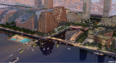
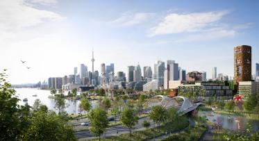
In March 2015, we unveiled five design concepts for the Jack Layton Ferry Terminal and Harbour Square Park. Each team presented its vision for revitalizing this important waterfront destination. We received lots of feedback on the proposals during the design competition. A Stakeholder Advisory Committee was also formed to generate a report for the competition jury with feedback on all five designs. In April 2015, the winning team was announced and work began to refine the master plan for this site. The winning design team of West 8, KPMB and Greenberg Consultants imagines a destination that attracts visitors to the waterfront while also better accommodating ferry passengers.
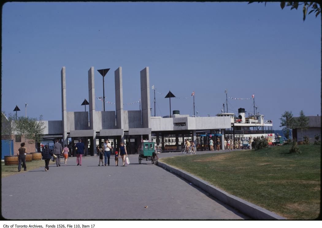
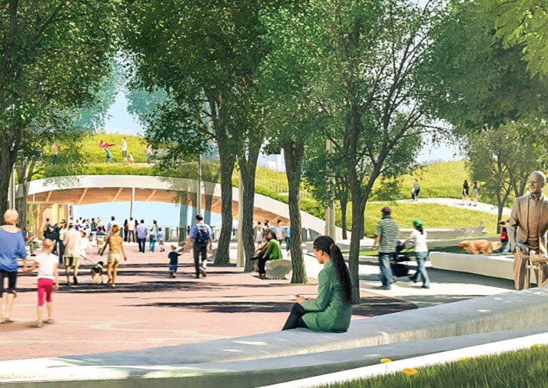
Top image: The Ferry Terminal as it appeared in the late 1970s. Above: This competition rendering imagines a green terminal entrance that draws people in and connects them to the neighbouring park.
In addition to refining the master plan based on stakeholder and public feedback, the design team is currently working to define phase 1 of this project. This will all be presented at a public meeting on January 26, 2016. More information about this meeting will be added to our event calendar in the new year.
To receive updates on the Jack Layton Ferry Terminal and other projects, sign up for our monthly newsletter [LINK] or follow us on Facebook and Twitter.
Responding to Feedback: How the Parliament Slip Preliminary Vision has Evolved
6 FAQs about Villiers Island